
Saving the planet, one council at a time.
Working with Ku-ring-gai council to achieve a net zero future.
The Zero Heroes Portal
Ku-ring-gai Council
Duration: 3 weeks
Tools: Figma, Miro
Team: Megan Carter, Graham Iversen, Lenny Hanniford
My role: UX Design, UI design, user research
Climate change is an urgent issue. A fact well understood by the Ku-ring-gai council. In a first for any council in NSW, they have committed to an action plan, aiming to reduce the emissions of the entire Ku-ring-gai area to net zero by 2040.
They paved the way by reducing their own carbon emissions by 20%. Spurred on by their own success, they now intend to help their residents achieve the same.
I was part of an ambitious three week design sprint. Our solution helps residents reduce their own climate impact by generating an action plan based on the unique input of the resident.
The Net Zero Communities

Ku-ring-gai Council has a plan to support the transition to zero emissions by 2040. They have already begun with their net zero information page on the council website. This consists of a series of information pages as well as links to rebates and incentives.
Their current program includes:
Carbon reduction information pages
Environmental factsheets
Incentives and rebates
Council projects
Community volunteer program
The Challenge
Bringing the information to the people
The council were open to us providing solutions that could be online and digital, communal and workshop or other mediums. The key determiners were finding out how residents liked to receive information and how they could be motivated and enabled to use the services and information.
Our solution had to be achievable and within council budget and technical limitations.
Our high level goal was to:

Reuse
We want to make the most of pre-existing content, rather than creating something new.

Empathise
We have to consider the residents of Ku-ring-gai and understand their motivations.

Simplify
Create a platform that simplifies the process of finding information.
The kickoff
Understanding the research.
From the outset of the project we were given extensive data from research that had already been conducted by the council. This consisted of:
• Analytics from the council's environment web pages.
• Raw data from the online survey, focus groups and community engagement evening, with over 600 respondents.
With this surplus of information, we were given a great starting point in trying to understand our users.
Looking at the comparative landscape
Ku-ring-gai council is certainly not the first to tackle this difficult issue. Our starting point was to look at the Ku-ring-gai website itself. We conducted a heuristics evaluation to fully understand their information architecture.
After we understood what Ku-ring-gai was offering, we compared this with other government websites to compare their approaches to sustainability and climate change. We also looked at other tools and websites that allow people to track and measure their own carbon emissions.
The discovery
Early insights from the field

The survey data provided a lot of first-hand comments and suggestions from the residents. One thing was loud and clear. The desire for change was strong. However there was no consensus among the people on what issue was the best to tackle first. Each resident had different priorities depending on their circumstance.
We created an emotional quadrant to create a snapshot of an average Ku-ring-gai resident.
“Do as I say, not as I do.”
From our look at the demographic information, for all their good intentions the people of Ku-ring-gai are the second biggest electricity users in the state of NSW. Our findings attributed this to the affluence of the neighbourhood.
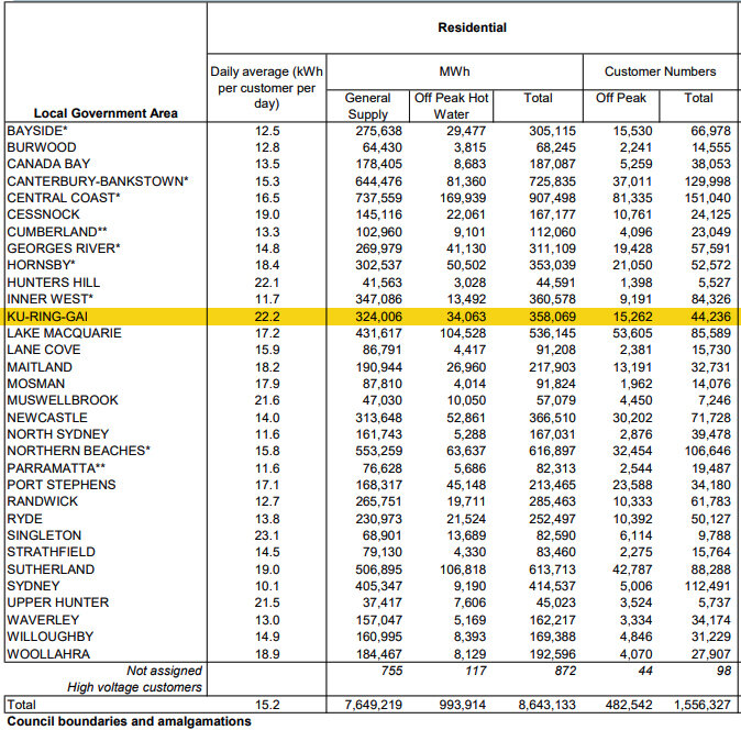
Source: Ausgrid Data 2018
“I didn’t know that existed.”
We made an interesting discovery. Many of the suggestions from the residents were for services that currently exist on the council website, such as rebates for solar installation and educational seminars. This showed that there was little awareness or education for the programs that are readily accessible.
“I can’t find what I’m looking for.”
Exploring the current net zero page on the Ku-ring-gai council website revealed a copy dense, deep level system of content. Many of the features residents were asking for existed, however they were hidden amongst a maze of links and irrelevant content.

The information architecture of the Ku-ring-gai council website.
“This just made me feel scared and guilty.”
Carbon footprint calculators on apps and websites have a strong emphasis on visualising the harm our actions have. Apps such as Earth Hero have the figures yet offer very little in terms of active measures to change this. The ecological footprint calculator on the WWF website simply shows how many planets would be needed to sustain your lifestyle. There was an opportunity here to create positive, pro-active experience for our residents.

So what’s the problem?
The residents of Ku-ring-gai are suffering from ‘climate bystander effect’
The term bystander effect refers to the phenomenon in which the greater the number of people present, the less likely people are to help a person in distress. In this situation, climate change is such an overwhelming existential threat, billions of people are involved, and the ways to address it are so varied, inaction is the outcome.
How do we get people on an individual level to start making a change?
Forming the hypothesis
Giving them clear directives and a reward will make them feel in control
When an emergency situation occurs, observers are more likely to take action when given directives from one member of the public.
It was time to take up arms and start giving clear directives. We needed to find a way to give specific tasks to the people living in Ku-ring-gai. We also had to reframe the rationale for changing behaviour. This wasn’t simply a moral duty, It was a benefit to the participant. By making use of the available resources, they are saving money, and building a better life for themselves and the community.
Understanding our users
So who are we designing for?
The residents of Ku-ring-gai are diverse. We needed a design solution that ensured an individual’s living situation was considered. However, there were a few key demographics that are prominent within the Ku-ring-gai LGA.
We created two example residents. Each represents one end of the spectrum in terms of housing and budget limitations.

The asset-rich empty nesters.
These are long term residents of Ku-ring-gai. They’ve lived most of their life here and have a relatively affluent lifestyle. They live in a five bedroom house that was built circa 1950 and poorly insulated. They’re looking to:
Insulate the house.
Reduce energy bills while still maintaining their lifestyle.
Looking for advice about water bills, pool filters and maintaining the pool.
Make use of a car sharing service for second car

The climate conscious share house student.
At the other end of the spectrum, we have a student with much more limited options. They’re currently renting in an apartment building, and are restricted by the rules of the landlord. They do however care about the environment and want to make a difference where they can. They are looking to:
Find out about solar cells for the building.
Find out what rebates from the Smart Units can he claim?
Start cycling and use the metro to get to MacQ uni.
Find a go-to app or website for info on local sustainable businesses and vegetarian restaurants.
Grow herbs on the balcony but needs advice from locals or the community gardens.
Narrowing our focus
Looking at our research, our first priority was to direct the people of Ku-ring-ai to the existing resources in a better way. Most are unaware that services they want already exist, and many are unaware how much electricity they’re actually using in their homes. In summary: The content had to be easy to find, relevant to their living situation, and a rewarding experience.
Our venn diagram shows the area that benefits both the council needs with what the users want.

What we want our users to experience

Empowered

Part of the community

Informed
We don’t want them to feel

Scared

Bored

Guilty
The website restructure
Reducing the noise for a better experience
As a team we conducted a prioritisation session. We balanced the needs of the Ku-ring-gai residents and the council against what could reasonably be explored within a 3 week sprint. Some features and functionality were essential such as the ‘onboarding quiz’, which aggregated content a resident might be interested in. We also decided re-organising content into manageable chunks of information was the path forward.
Other features we decided were either too costly for the council to develop at this stage, or would have little impact for the cost involved. At this stage we decided to focus on what we knew would have the highest impact for the least implementation cost.

Streamlining the current experience of the website
Because our starting point was the Net Zero community pages on the council website, it was worthwhile taking a look at the current user journey. We mapped the journey of a resident trying to find information on reducing power bills, and their experience filling in the relevant forms. There was a significant issue with them locating the information they needed.

So let’s help them find what they need
We began sketching potential ideas for a landing page. Our first step was to learn more about the users themselves. Who were they? What kind of living arrangement did they have? How did they get around. All of this was important to know so that we could show them the right information.
The paper prototype

Our landing page asked a few non intrusive questions to create a better picture of the individual.
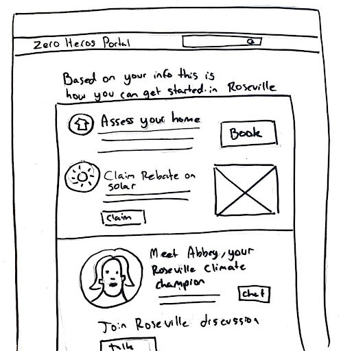
The results from the landing page generate a personalised action plan. Now the user only sees what’s right for them.
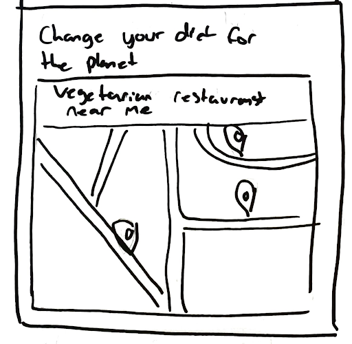
Maps of the Ku-ring-gai area now show sustainable services and businesses.

We utilised the existing council content, doing away with superfluous copy and creating short-forms for quick sign-ups.
The journey is now streamlined
Based on our proposed solution, we now have an improved user journey. One that does away with irrelevant content and only shows the user what they need to see.

The first review
Chatting with the client
On September 9th we had a catchup meeting with our client to discuss our findings. The reception was positive and they felt that cutting through to relevant information was the right strategy. However they did have some feedback:
Something we had overlooked was the utilisation of local experts. Ku-ring-gai has a large network of environmental experts that would be willing to come on board and share their expertise. We needed a way to bring this resource into our design and create a better conversation between residents and the council.
We can’t save sensitive information, so users won’t be able to create accounts. The site will have to rely on cookies to remember return users.
The residents of Ku-ring-gai are very traditional and might be hesitant using a system that’s too revolutionary. We’ll need to have some familiarity in it.
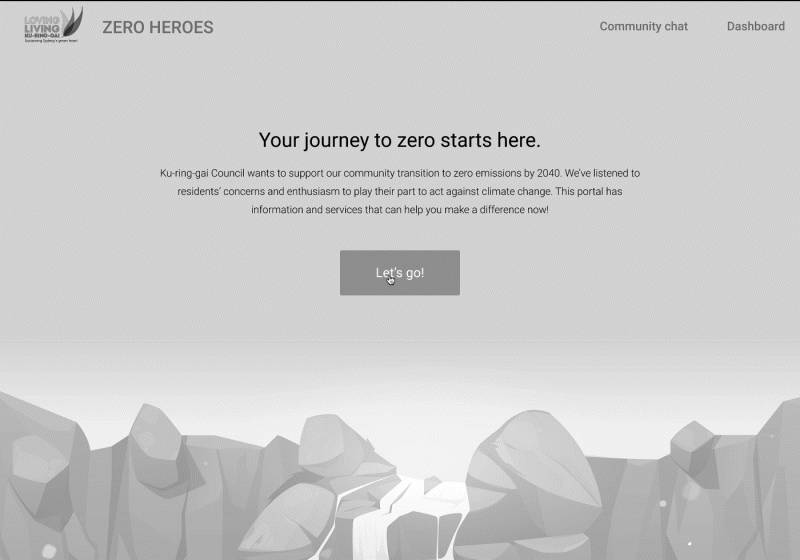
What we built
Introducing the Zero Heroes Portal
Our solution involved making the most of the council’s content. This meant finding a way to filter content that was only relevant to the individual. We had to cut through the noise and only show people what they needed to see.
Finally, it needed to be a positive and empowering experience for the user.
Usability testing
“Dial up the visuals to keep me engaged”
We did a round of usability testing with members of the council to get some feedback.
And also some areas to look at:
“There’s a lot of text. I’d like to see more graphics.”
“Time poor users need an option to sign up for a newsletter.”
“I’d like to see a hero progress bar and some completion badges.”
“We need more icons and graphics to reflect the content.”
There were some positive notes:
“I really enjoy the streamlined content”
“It’s very empowering. I like that.”
“The group chat has potential.”
“The one action click-through is great”